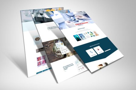
We have recently completed an exciting logo design project for our client, Kinetic Safety Group, a leading provider of comprehensive safety solutions and training services. The primary goal of this project was to create a strong, recognisable brand identity that effectively communicates Kinetic Safety Group’s commitment to ensuring the safety and well-being of their clients.
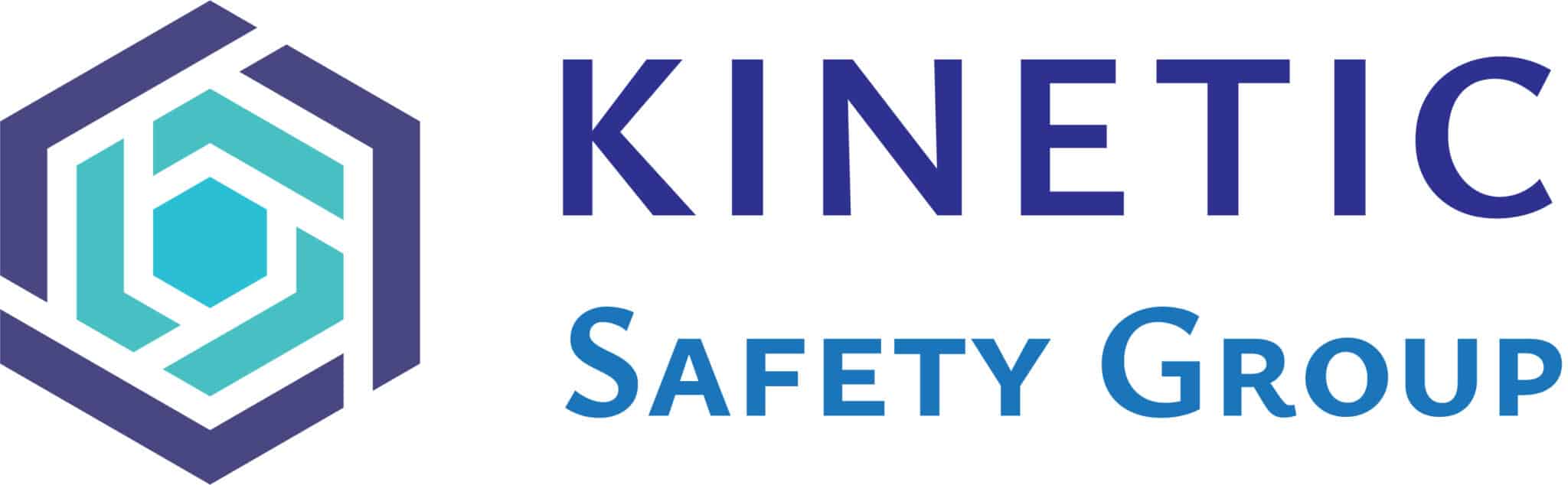
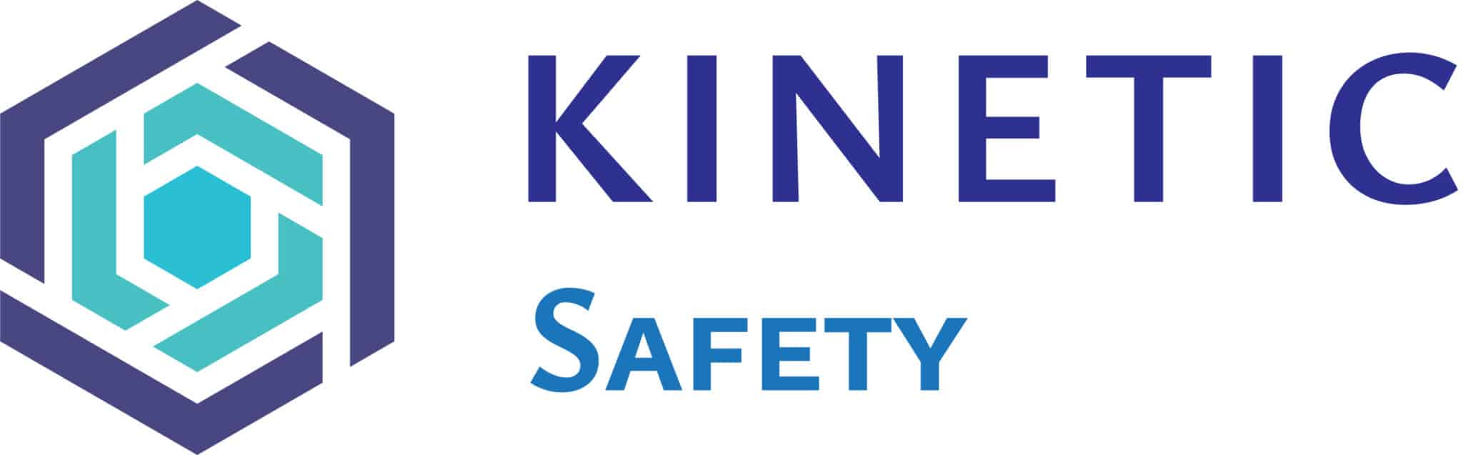
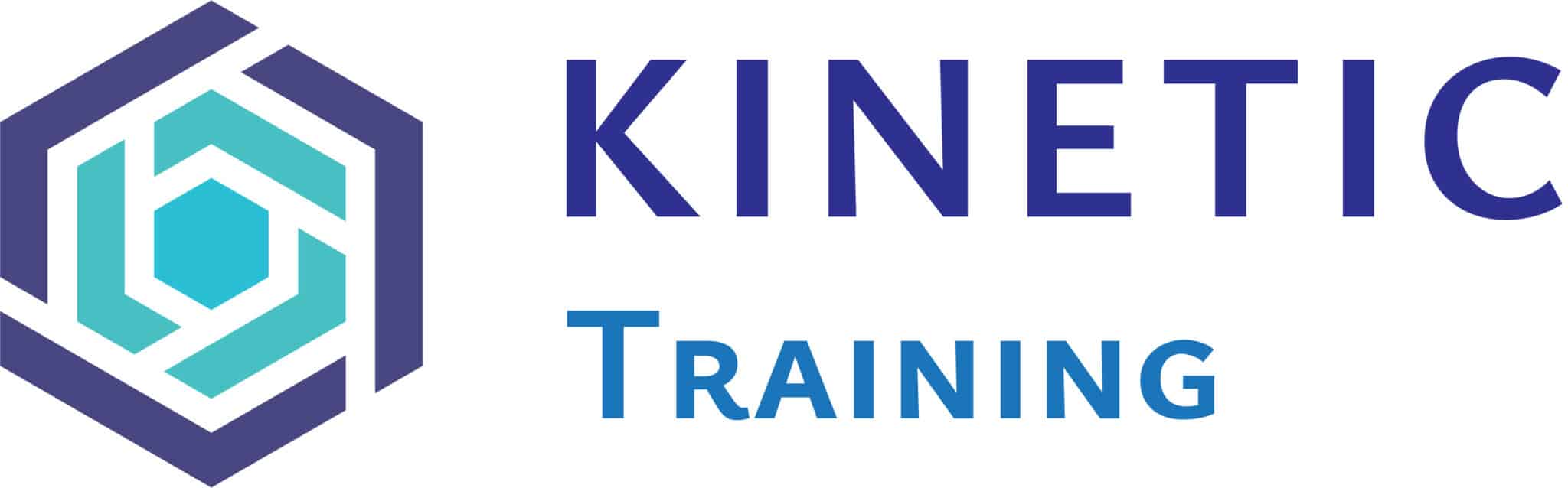
To achieve this objective, our talented design team worked closely with the client to develop a logo that incorporates a meaningful symbol representing the core concepts of safety and group collaboration. The resulting design features a distinctive hexagonal motif, composed of interlocking geometric shapes in varying shades of blue. This abstract symbol serves as a powerful visual metaphor, conveying ideas of unity, protection, and coordination – all essential elements of successful safety practices and group dynamics.
The hexagonal emblem is paired with the company name, set in a bold, modern typeface that reinforces the brand’s professionalism and reliability. The chosen colour palette, predominantly featuring shades of blue, further enhances the logo’s visual impact and messaging. Blue is widely associated with qualities such as trust, stability, and dependability, making it an ideal choice for a brand operating in the safety industry.
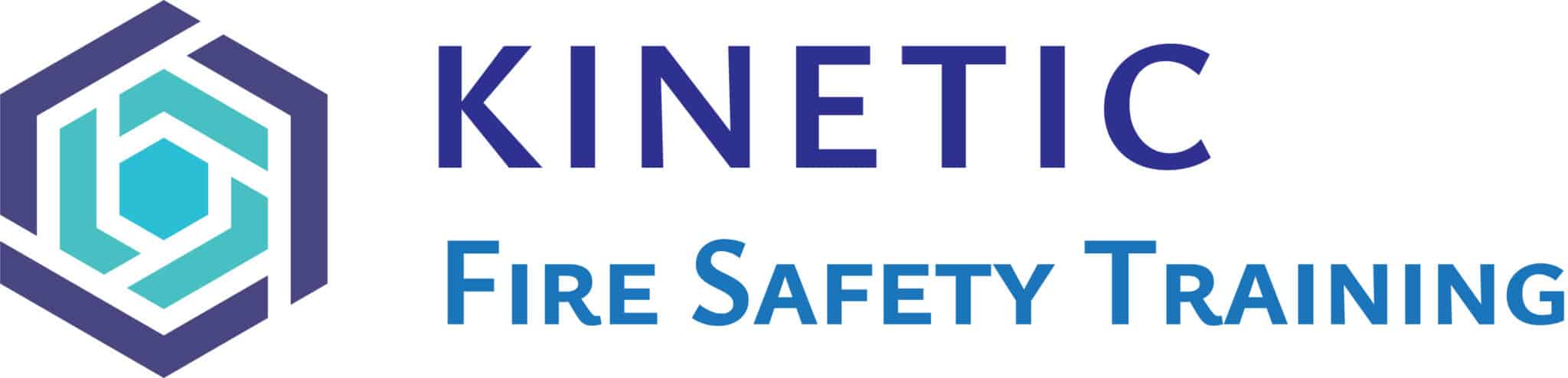
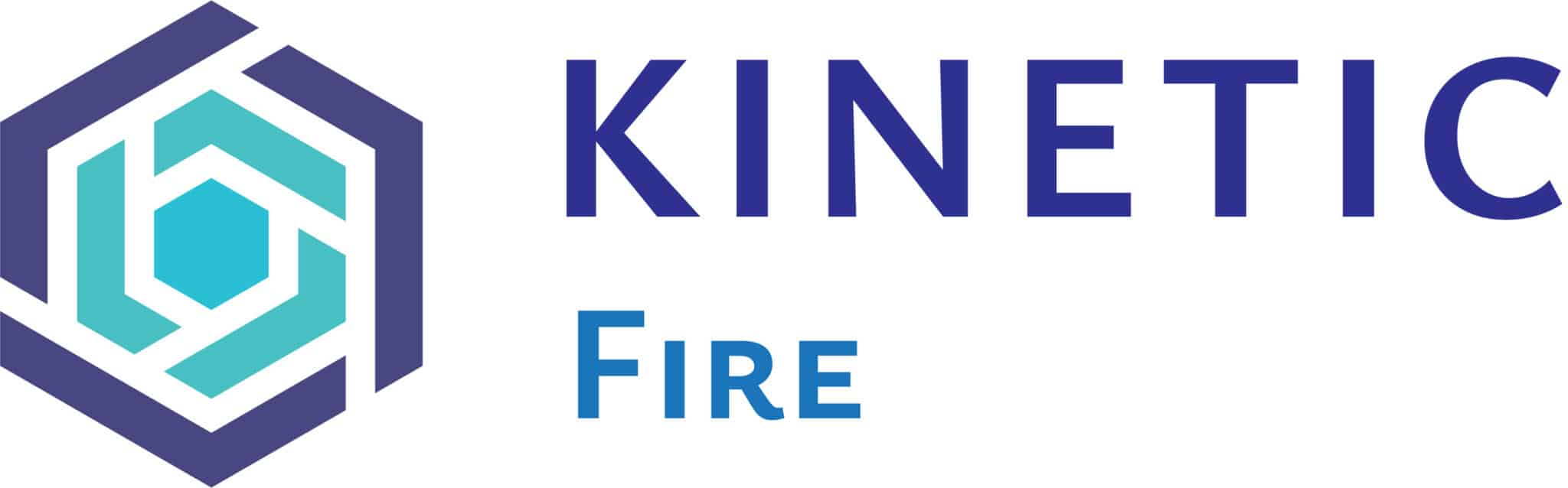
In addition to the primary Kinetic Safety Group logo, our team also developed a series of sub-logos for the various branches of the business, including Fire, Safety, and Training divisions. Each of these sub-logos incorporates the same hexagonal symbol, ensuring a consistent and cohesive brand identity across all aspects of the organisation. This approach not only strengthens brand recognition but also reinforces the idea that safety is a unifying principle that permeates every facet of Kinetic Safety Group’s operations.
Throughout the design process, we prioritised creating a logo that is versatile, and memorable and effectively communicates the client’s core values and mission. The final design successfully achieves these goals, providing Kinetic Safety Group with a powerful visual identity that will help them stand out in their industry and build strong, lasting relationships with their clients.
The new Kinetic Safety Group logo is more than just a visual representation of the company; it is a symbol of their unwavering dedication to promoting safety, fostering collaboration, and delivering exceptional service. By investing in this strategic branding initiative, Kinetic Safety Group has taken a significant step towards establishing themselves as a leader in their field and positioning their business for long-term success.
As we reflect on the successful completion of this logo design project, we are confident that the new brand identity will serve Kinetic Safety Group well as they continue to grow and evolve. We are proud to have played a role in helping them create a strong, memorable brand that accurately reflects their values and expertise, and we look forward to seeing the positive impact this new logo will have on their business in the years to come.