
Crafting a Fresh Brand Identity with a Vibrant Logo Design for Bright Space Therapy
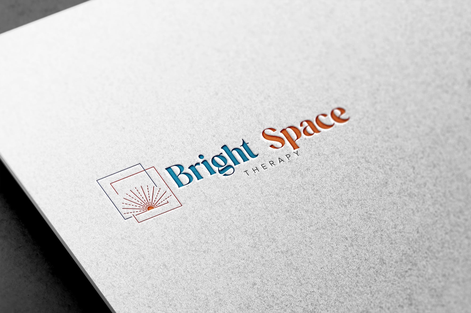
Introducing Bright Space Therapy, a promising new entrant in the realm of psychological wellness, situated in the heart of Caloundra. In their pursuit to establish a compelling brand presence right from the start, the core objective was to create an entirely new logo that resonates with their essence. DIGITALON enthusiastically took on this challenge and, with innovation and precision, sculpted a minimalistic yet impactful logo that not only mirrors the business’s ideals but also has the potential to captivate a diverse audience.
Key Features
Grasping the Vision: At the inception of any successful logo design venture is the fundamental comprehension of the client’s vision. Bright Space Therapy’s aspiration for a logo that encapsulates therapeutic care, inclusivity, and a beacon of optimism was paramount. Through exhaustive research and analysis of provided examples, we recognised their need for a logo that projects professionalism and diversity, moving away from being excessively tied to child counselling.
Signature Minimalism: Embracing the client’s preference for geometric shapes and vibrant hues, our designers embarked on creating a logo that echoes simplicity while making a resounding impact. The use of geometric forms conveyed solidity and equilibrium, emblematic of the support and balance therapy offers. The judicious application of colours infused the logo with an air of positivity and vitality that captures attention.
Strategic Typography: One of the intriguing aspects of this project was emphasising “Bright Space” within the logo while moderating the prominence of the term “Therapy.” Our design approach involved choosing a font that radiates professionalism, trustworthiness, and modernity. Through meticulous adjustments in font size and style, we ensured “Bright Space” took centre stage without overshadowing the entire logo, accomplishing the desired equilibrium.
Universal Appeal: The challenge lay in creating a logo that mirrors Bright Space Therapy’s holistic approach to psychological wellness. The design needed to resonate inclusivity, transcending demographics and age groups. By artfully incorporating elements that diverge from the exclusive domain of child counselling, the logo emerged as a symbol of comprehensive care, a sanctuary for individuals from all walks of life.
Conclusion
In summary, the journey of crafting the logo for Bright Space Therapy mirrors a fusion of artistic ingenuity, empathy, and strategic finesse. Through a meticulous distillation of the business’s ethos, we fashioned a logo that stands as a beacon of optimism, solace, and transformation. The equilibrium between minimalist design and vibrant colours culminated in a visual identity that speaks universally to those seeking emotional well-being. By skillfully managing typography and expanding the focus beyond child counselling, we addressed the challenge of producing a versatile logo with resonance beyond a specific demographic.
As Bright Space Therapy embarks on its mission to make a meaningful impact, we are proud to have contributed to the establishment of their brand identity. Beyond being a mere emblem, this logo embodies their commitment to a brighter future, one therapeutic engagement at a time.
