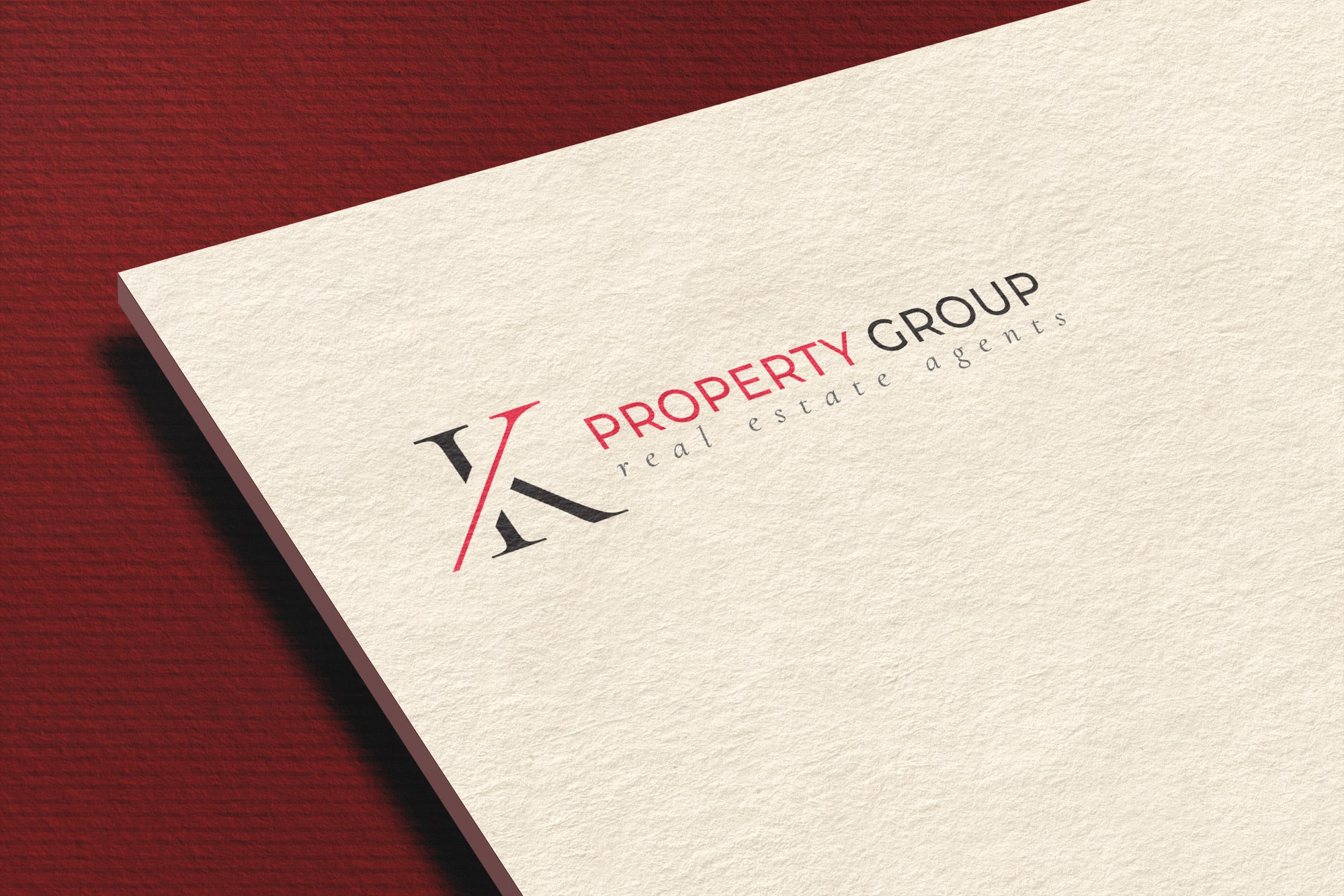
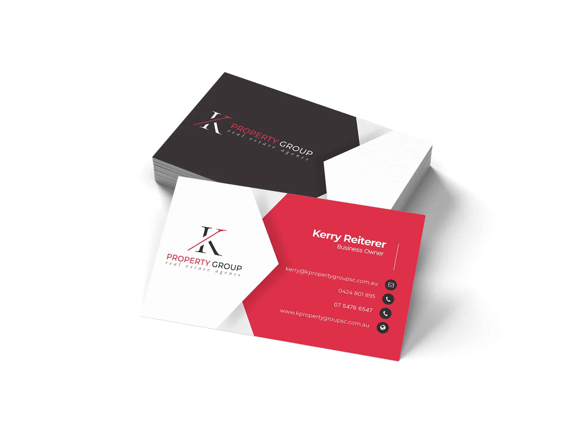

We recently completed an extensive rebranding project for K Property Group, a renowned real estate firm in the region. This ambitious undertaking aimed to revamp the company’s visual identity, aligning it with their evolving brand and market position. The project encompassed the design of a new logo, business cards, and an HTML email signature, each element crafted to embody the client’s vision and industry stature.
The project’s cornerstone was the development of a simple yet memorable logo. Our creative team embarked on an exploratory journey, experimenting with numerous versions of the ‘K’ icon. This process involved a meticulous exploration of various colour combinations and fonts. The goal was to strike a balance between sophistication and accessibility, ensuring the logo’s adaptability across diverse mediums. The final design, a sleek and modern interpretation of the ‘K’, emerged as a distinct emblem that encapsulated the essence of K Property Group.
An integral part of the rebranding was the design of business cards. A key feature of these cards was their versatile layout, enabling easy customisation for all employees. This adaptability was crucial in maintaining brand consistency across the company’s diverse team. The business cards were designed to complement the new logo, with a clean, elegant layout that mirrored the firm’s professional ethos.
The project also included the creation of an HTML email signature. This signature was not only a practical tool for daily communications but also a strategic branding element. It featured the new logo and was designed for consistency with the overall visual identity of K Property Group. To add a dynamic touch, our client extended the project to include an animation of the logo in GIF format, which was seamlessly integrated into the email signature. This animated logo added an innovative and engaging aspect to the signature, enhancing the brand’s digital presence.

Throughout the project, our team maintained a collaborative approach with K Property Group. Regular consultations and feedback sessions ensured that our designs aligned with their vision and expectations. The client’s satisfaction was paramount, and their positive response to the final deliverables was a testament to the project’s success. The client’s enthusiasm was particularly evident in their decision to expand the scope to include the animated logo, reflecting their confidence in our creative capabilities.
This rebranding project for K Property Group is a prime example of DIGITALON’s expertise in creating compelling visual identities that resonate with both the client and their audience. Our dedication to exploring various creative avenues – from multiple iterations of the ‘K’ icon to experimenting with different colour schemes and fonts – culminated in a branding solution that the client loves. The project’s success underscores our ability to understand and translate client needs into tangible, impactful designs.
In conclusion, the rebranding of K Property Group by DIGITALON highlights our proficiency in delivering comprehensive and customised branding solutions. From the conceptualisation of a distinctive logo to the execution of practical yet stylish business cards and an interactive HTML email signature, this project showcases our commitment to excellence in design and client satisfaction. It stands as a benchmark for future endeavours in the realm of logo design on the Sunshine Coast, demonstrating our unwavering dedication to elevating brands through innovative and tailored digital solutions.
