
Rebranding Sunview Windows & Doors with a Fresh Logo Design
In a world where a logo speaks volumes about a business, Sunview Windows & Doors took a significant step towards redefining their brand identity. Formerly known as Sunview by Style – Glass & Aluminium, the company embarked on a journey to modernise its image. The client was enthusiastic about the prospects of rebranding, and they came to us with a vision to breathe new life into their business through a fresh and vibrant logo.
Client’s Vision and Initial Sketch
The client, based on the beautiful Sunshine Coast, approached us with a sketch that served as the foundation of the project. Their vision was clear – they wanted a logo that combined the essence of their business, focusing on windows and doors, and emphasised their transition to a more contemporary and appealing brand. The challenge was to create a design that embodied these key elements while ensuring that it effectively communicated their brand’s personality.
The client provided a basic sketch to guide us in the right direction. The sketch featured abstract representations of a window and a door, and it incorporated the colors yellow and blue. These elements were crucial as they had been associated with the brand for some time and held a special place in the client’s heart.
Crafting the Perfect Logo
Our team of experienced designers got to work, fully aware of the responsibility of capturing Sunview Windows & Doors’ spirit and message. The initial phase of the project involved exploring various design concepts, inspired by the client’s sketch. We wanted to ensure that the logo not only represented windows and doors but also conveyed a sense of reliability, security, and the beauty that Sunview’s products brought to their customers’ lives.
To achieve the perfect balance, we tried various yellow options to find the perfect fit, ensuring that the shade was not only visually appealing but also aligned with the client’s branding goals. The process was a blend of art and science, as we meticulously selected shades and tones that would optimally represent the company’s message.
Symbolism in the Design
The client’s sketch served as an excellent starting point, but we knew that the final logo had to be much more refined and versatile. We wanted to create a logo that would not only look good on a storefront but also on marketing materials, websites, and even merchandise.
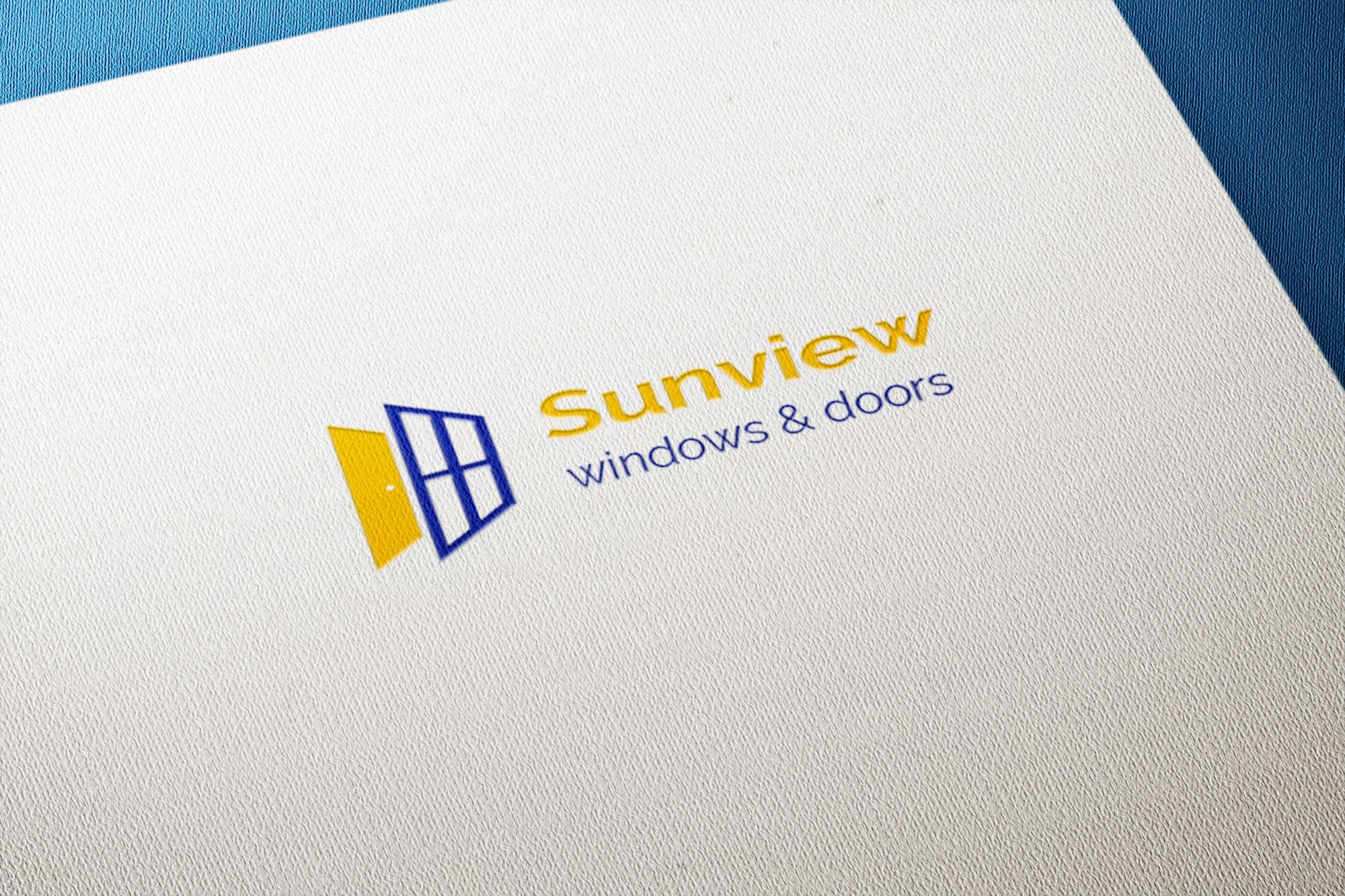
The window and door symbols in the logo were the heart of the design. The window symbol represents the transparency and clarity that Sunview Windows & Doors offers to its customers. It signified a view to a brighter future, emphasising the company’s commitment to enhancing homes and spaces. The door symbol, on the other hand, was a representation of the welcoming, secure, and accessible nature of Sunview’s products.
The chosen shades of yellow and blue were not just random selections. Yellow symbolised positivity, warmth, and the radiance that Sunview’s windows brought to homes. Blue represented trust, reliability, and the calm assurance that Sunview’s doors offered. Together, these colours created a harmonious balance that visually communicated the brand’s values and identity.
The final design brought together these elements seamlessly, creating a logo that showcased both the company’s dedication to quality and its ability to enrich the lives of its customers. The clean lines, smooth curves, and bold colours made for a memorable and versatile logo that would resonate with the target audience.
Client Satisfaction
When we presented the final logo to the client, they were thrilled with the outcome. It perfectly encapsulated their vision, and they could see how it would help them rebrand their business successfully. The logo design was not just a graphic; it was a symbol of their transformation and growth. The client expressed that they were very happy with the outcome and believed that this logo would greatly enhance their brand’s visibility and recognition on the Sunshine Coast and beyond.
Sunview Windows & Doors now had a logo that would help them stand out in a competitive market. They were excited about the possibilities it offered for their marketing campaigns, from website branding to promotional materials. They were confident that this logo would make a lasting impression on their existing and potential customers.
Conclusion
In conclusion, the journey of rebranding Sunview Windows & Doors was a fulfilling experience for both the client and our design team. The creation of a new logo that combined the elements of window and door symbols, along with the careful selection of yellow and blue, was a successful endeavour. The resulting logo perfectly captured the essence of the business, conveying its values and promise to its customers.
The client’s enthusiasm and involvement in the project were essential in achieving this outstanding outcome. Their trust in our expertise and design skills, coupled with their clear vision and feedback, played a vital role in the project’s success.
We are confident that the new logo will empower Sunview Windows & Doors to continue their journey of growth and success. It represents not only the quality of their products but also their commitment to creating spaces that are beautiful, secure, and welcoming.


