Website navigation is more than a row of links at the top of a page. It is the set of routes that helps people understand what a business offers, find relevant detail and take a next step. For a small business, clear navigation can reduce the effort involved in comparing services, checking practical details or getting in touch. But a menu that mirrors internal departments, uses vague labels or exposes every page at once may leave visitors unsure where to go. Start instead with the tasks customers arrive to complete. Use those tasks to shape page groups, choose familiar labels and create more than one sensible route to important information. Navigation also includes links within page content, prominent actions, breadcrumbs where useful and footer links—not just the main menu. The right structure depends on your services, audience and website size, so there is no universal menu to copy. A simple plan and a few realistic tests can help you organise pages around customer needs before adding more content. This guide covers practical ways to plan, label and check those routes.
Content
Start with customer tasks
Map what visitors are trying to do
Begin with the people who visit your website and the questions or actions that bring them there. A page list describes what your business has to say; a task list describes what a visitor needs to accomplish. Those needs might include understanding whether a service suits them, checking where you operate, comparing options, learning what to expect or taking a next step. Write each task in plain language from the visitor’s point of view, rather than using internal department names or website terminology.
Gather ideas from the places where customer questions already appear. Review enquiries, phone conversations, feedback, search terms if available, and questions staff answer repeatedly. Ask people who deal directly with customers what visitors often misunderstand or struggle to find. Then check your assumptions with a few representative customers or people unfamiliar with the business, if you can. The aim is not to collect every possible question, but to build a grounded picture of the main reasons people arrive and what they need before they can act.
Turn that list into journeys by arranging tasks in the order a visitor is likely to need them. For each priority journey, note the starting point, the information needed along the way, any decision the visitor must make, and the intended next step. For instance, someone considering a service may first need to confirm it is relevant, understand what is included, and then find out how to enquire. Treat this as a planning prompt, not a fixed route: visitors may arrive on different pages or already know what they want.
Choose priorities deliberately. Consider how important a task is to customers and to the business, how often it appears in enquiries or other available evidence, and what is at stake if people cannot complete it. A less frequent task may still deserve attention if it is essential to making an informed decision or accessing an important service. Avoid letting the loudest internal preference or the largest page count determine what matters most. Record why each task is a priority so later decisions have a clear basis.
Keep the result practical: a short, ranked set of visitor tasks with a clear outcome for each. Avoid turning every small question into its own journey; combine related needs where the same information helps visitors move forward. If different audiences have genuinely different goals, note those distinctions rather than assuming one route works for everyone. You can use the priority journeys to judge whether the site’s structure supports real needs, and to decide which pages and routes deserve attention first. Revisit the task list when services, customer questions or business priorities change.
Group related pages
Build the menu around meaningful groups
Once you know what visitors need to do, organise the pages that support those tasks into a hierarchy. A hierarchy shows how broad topics relate to more specific information: a main menu item can lead to a section overview, which in turn links to relevant detail pages. This gives visitors a mental map of the site, rather than a flat list of pages they must interpret one by one.
Start by listing the pages you have or plan to create, then sort them by the subject a visitor would recognise and the question each page answers. Pages belong together when they help with the same decision or task, not simply because the same team created them. For instance, information about a service, its process and what to expect may form a useful group if visitors are likely to consider those details together. A page that serves a different need may be better placed elsewhere, even if it concerns the same part of the business.
A helpful test is to look at a proposed group and ask: would someone looking for one of these pages reasonably expect to find the others nearby? If the answer is yes, they may share a parent section. If a group collects unrelated pages just to keep the menu short, it is probably too broad. Conversely, a group with only one child page may not need its own layer; the page could sit directly in the main navigation or be linked from a more relevant section. The right structure depends on the amount and relationship of the content, not a fixed number of menu items.
Give each page a clear home
For each page, decide on one primary place in the hierarchy. This makes the site easier to maintain and helps visitors understand where they are. A page can still be linked from other relevant pages without appearing in multiple menu groups. For example, an appointment page might be linked from a treatment page as a useful next step, while keeping a single home in the main structure. Treat those contextual links as signposts, rather than reasons to duplicate the page.
Hypothetical example: A local clinic groups treatment information, practitioner profiles and appointment details under a clear “Services” area. The clinic could make that section an overview that helps visitors choose what to explore, then organise the more specific pages beneath it. Before adopting this arrangement, the clinic should check whether visitors are likely to understand those subjects as parts of one service journey. If appointment details are mainly sought independently, the clinic might instead give them a more direct route from the main menu while still linking to them from relevant treatment pages.
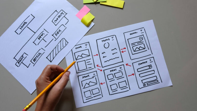
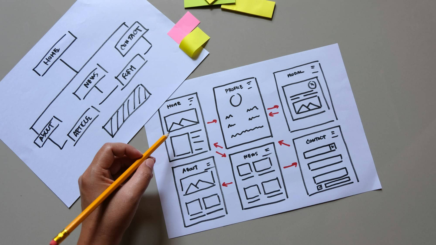
Sketch the proposed structure before changing the website. Write the main sections at the top, place related pages beneath them, and note any pages that seem difficult to categorise. Those awkward cases can reveal overlapping topics, missing overview pages or content that needs to be separated. Then walk through a few realistic tasks and trace the route to the right page. If you have to guess where information lives, revisit the grouping. A sound hierarchy should reflect visitors’ understanding, not internal departments, and should remain simple enough to update as the business adds or changes content.
Choose clear labels
Write labels visitors recognise
Menu labels should help visitors predict what they will find before they click. Use concise, familiar words that describe the destination from the visitor’s point of view, rather than language that makes sense only inside your business. A person looking for your opening hours should not have to interpret a clever slogan or know how your team names that information.
Start by writing down the main pages or page groups in your navigation. For each one, ask: what question would a visitor have, and what words would they naturally use to find the answer? Choose a label that reflects that intent. “Services” may suit a business with several types of work to explain; “Repairs” may be clearer if visitors mainly need to find repair information. The best choice depends on what people need to do, not on a universal set of menu terms.
Prefer plain language over internal names, abbreviations and industry jargon. A team might call a page “Client Solutions” or “Our Methodology”, but visitors may be more likely to look for “Services” or “How it works”. If a technical term is essential, pair it with a familiar explanation where practical. Keep labels short enough to scan, while making them specific enough to distinguish one destination from another. A label such as “More” rarely tells visitors what is behind it; use it only when the items inside are genuinely secondary and the menu makes those items easy to inspect.
Avoid labels that promise the same thing in different words. If the menu includes both “What we do” and “Services”, visitors may not know which to choose. Check that every label has a distinct purpose and that the page it opens fulfils the expectation it creates. This matters especially for labels such as “About”, “Contact” or “Resources”: they are familiar, but the pages grouped under them should still be an obvious fit. If a section contains several kinds of information, consider whether a more precise label or a different grouping would make the route clearer.
Use consistent wording across the menu and the pages it links to. For example, if the menu says “Book an appointment”, the destination should make it immediately clear how to proceed, rather than opening a page headed with an unrelated internal term. Consistency helps visitors confirm they have reached the right place and reduces the need to retrace their steps. It also makes navigation easier to maintain when pages are added or renamed.
Review labels in context, not just in a list. Read the menu from a visitor’s perspective and check whether the choices are easy to scan, clearly different and understandable without extra explanation. Ask someone unfamiliar with your business what they expect to find under each label, then compare their expectations with the actual pages. If they hesitate or choose an unexpected route, treat that as useful evidence: revise the wording or reconsider where the page belongs. Clear labels are not merely shorter names; they make the next step easier to recognise.
Make key routes easy
Connect the routes visitors need most
Once priority pages are clear, make it straightforward to reach them from the places visitors are likely to start. A page’s importance should be reflected in its links, not just its position in the site hierarchy. Map the main routes people need to take, such as moving from a service overview to details and then to an enquiry or booking step. This helps you decide which links belong in the main menu and which make more sense within a page.
Use the main menu for destinations that matter across the site, with concise labels that match the page content. Keep the number of top-level choices manageable, and group related destinations under a clear parent where that makes the menu easier to scan. Avoid adding a page to the main menu simply because it exists. If visitors usually need it after reading about a particular service, a well-placed in-content link may be more useful than another top-level item.
Add in-content links where they answer a likely next question or help someone continue a task. For example, a service page might link to relevant preparation information or the appropriate enquiry page. Put the link near the information that makes it useful, rather than expecting visitors to search the menu again. Make link text describe its destination: “See our appointment options” is clearer than “click here”. Descriptive links help people understand what will happen before they select one, including when they scan a page quickly.
Give each priority page a clear next step that fits the visitor’s purpose. That might be contacting the business, requesting an appointment or reading a closely related explanation. Use action wording that names the task, and place the action where it follows naturally from the page’s content. Avoid presenting several equally prominent choices if one is the logical next move; too many competing prompts can make it harder to decide. Make sure the destination supports the wording, so a link labelled “Request an appointment” leads to the relevant step rather than a general page.
Check for gaps in each route. Can someone reach the relevant information without returning to the homepage? After completing a task, is there a sensible way to continue or find related details? Where a page is useful but not suitable for the main menu, link to it from the pages visitors are most likely to need it from. A footer can provide secondary routes, but it should not be the only way to reach important information. Also check that links are current and do not send visitors to an unexpected or outdated destination.
Keep the route consistent from link to destination: labels, page headings and next-step wording should tell the same story. When services or page content change, review the links that lead to and from those pages. This keeps useful journeys connected and makes navigation work as a set of practical pathways, rather than a collection of separate pages.
Check navigation on real devices
Test the journeys visitors need to complete
Before launch, check the navigation by asking someone unfamiliar with the site to complete realistic tasks. Choose tasks that reflect why people visit, such as finding a particular service, checking where a business operates, locating delivery information or working out how to make an enquiry. Give the tester a goal, not a set of directions: “Find out whether this service is available in your area” is more revealing than “Click Services, then Areas.” Watch where they look, what they select and whether they hesitate. Avoid explaining the menu while they work; uncertainty is useful evidence about what needs attention.
Test complete page paths, not just the main menu. A visitor may arrive on a service page from search or a saved link, then need to reach related details or take a next step. Check whether links within the page make that route clear, whether labels match the destination and whether the visitor can return to a useful point without repeatedly starting over. Also try common journeys from the homepage and from deeper pages. If people repeatedly choose the wrong link or cannot tell what to do next, consider whether the label, page grouping or in-content link needs adjusting.
Repeat the tasks on a phone and a larger screen. On mobile, check that the menu is easy to find and open, that its options are readable and that visitors can select them without accidentally tapping a neighbouring item. Look for clipped text, excessive scrolling inside the menu, links hidden below the fold and pages that are difficult to scan after a menu choice. On desktop, check that dropdowns do not cover important links or disappear before a visitor can reach them. Test with the browsers and devices available to your team or testers; a single screen size cannot show every layout issue.
Check keyboard access as well as touch and mouse use. Starting with the keyboard, move through the page using Tab and Shift+Tab, open menu items with the available keyboard controls, and follow links with Enter. Confirm that the current focus is visible, the order of links makes sense and a visitor can reach and leave any submenu without getting stuck. If the menu’s behaviour is unclear, revise it or seek accessibility advice rather than assuming that a pointer-based test is enough. Do not rely on colour alone to show which item is selected.
Keep a short record of each task, the device used, where the tester paused or took an unexpected route, and what change you will try. Fix issues that block access to essential information first, then retest the same task to see whether the path is clearer. A simple checklist helps: can visitors identify the menu, understand its labels, reach the intended page, use the route without a mouse and complete the task on a small screen? Treat these checks as part of launch preparation, not a substitute for reviewing the site after it goes live.
Conclusion: keep improving
Review changes with evidence
Navigation should be revisited when services change, new pages are added or customer questions shift. Set a regular review point—such as when planning a service update—and check whether menu labels and page groupings still match the words customers use. A structure that suited the business when the website was first organised may no longer make the most useful routes obvious.
Use practical evidence rather than assumptions: note questions received by phone or email, review on-site search terms or analytics where available, and ask a few customers to find a specific page while you observe where they hesitate. Record the sticking point, its likely cause and a small proposed change. A label may be unclear, a key page may sit too deep, or related information may be split across sections. Treat each observation as a prompt to investigate, not proof that one change will suit every visitor.
Prioritise changes that help several important customer tasks, not simply the latest request. Make one considered adjustment at a time, then repeat the same task on desktop and mobile, including keyboard navigation, to check that the route is clearer and remains usable. Keep a short change log so future reviews can distinguish a recurring issue from a one-off request.
Keep the review proportionate to your website. A small site may need only a page list, a few representative tasks and a brief check after important updates. A larger site may benefit from reviewing sections separately and recording which pages depend on each other. In either case, avoid changing labels or page locations without checking the links and pathways affected. Thoughtful, small adjustments help keep navigation aligned with customer needs as the business develops.
Explore related information: Booking Website Design & Development; Web Design Sunshine Coast.